Hey! How is your Thursday treatin’ ya?! Mine is pretty much over, meaning I don’t have any other plans on my agenda for the day. After a three hour class and a good workout, I thought I would pop in here and chat about the proposed new food label. Let’s chat over lunch, shall we?
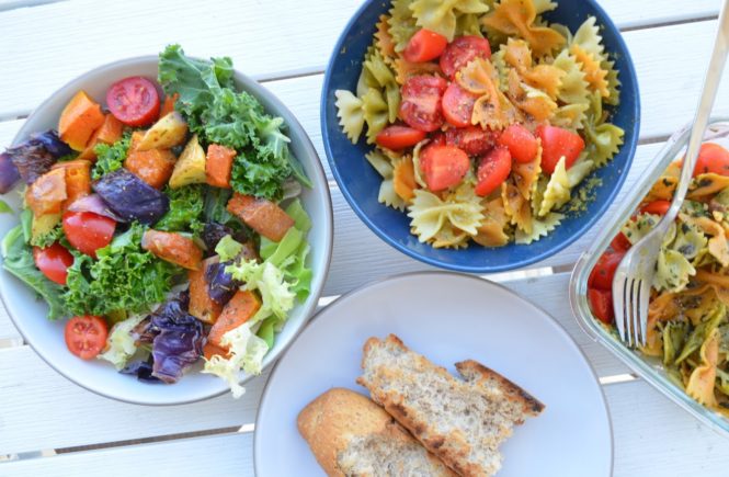
I’m having: Half of a wheat bagel with peanut butter and 1/2 banana, 1/2 strawberry jelly…
and: Spinach, carrot, tomato, and apple juice! Refreshing 🙂
This is literally the only food that I could scrounge to make a meal out of. It’s pathetic, but at least it’s yummy! What are you having?
Moving on…Let’s chat!
You have probably already heard, but the FDA has created and proposed a new food label that is currently in a 90-day discussion/ comment/ debate period.
So let’s discuss/comment/debate! [All images are from the FDA website.]
The current label was created over 20 years ago, meaning that some of the recommended daily values are out of date. The new label will feature updated nutrition information, including a line for added sugars, information about vitamin D and potassium (instead of vitamin A and vitamin C- which Americans usually get enough of, updated daily values, and larger font.
Here is a comparison of our current label and the proposed label:

I think the added sugar line is a great addition, as it will make it easier to differentiate naturally occurring sugar (fruit, lactose, etc.) from added sugars. For example, I was reading the nutrition labels on yogurt containers. Strawberry yogurt had 25 g of sugar/ serving, while plain yogurt had 14 g. This new label would more clearly identify the difference between the two and make it easier for the “average joe” to understand.
Additionally, the larger font is a plus! The easier the label is to read, the more people will actually-you know– read it! I think bigger font makes it less intimidating and easier to understand.
Here is a proposed label that would compare serving size vs. the entire container:
This looks like another good option, as it would clearly show the information for one serving or for the entire container.
Pros: Eat that entire tub of ice cream, but here is the information. This label shows everything you need to know in one place.
Cons: A lot of information to have on a label.
And another label:
This one is really “dumbed down” and I think this is as easy as it’s going to get.
Pros: easy language; tells you exactly what to eat more of or less of
Cons: Most different from the current label and may take some time to get used to
Besides the nutritional information, there is discussion about changing the serving sizes on products to more closely align with typical serving sizes.
Who buys a twelve ounce bottle of soda and only drinks 8 ounces? No one. Does anyone buy a “single serving” bag of chips and only eat half the bag? No. And I don’t remember the last time I only ate 1/2-3/4 cup of cereal. The FDA websites states that, by law, serving sizes must reflect what people actually eat, instead of what they should eat. It’s a harsh reality that we like our ice cream enough to eat a cup (or more!) of it in one sitting.
To prove my point- last week, I bought a bag of some sort of “quinoa/ bean” chip as part of a “meal deal” on campus. I grabbed the bag after glancing over the nutrition facts and seeing that a serving only had 180 calories and a moderate amount of fat. As I was chomping down on them, I took a harder look at the information and realized there were THREE servings in the bag. I’m a nutrition major and generally interested in what I eat and have a good understanding of how to read a label. Regular people could easily glance over it! (Not to say that the nutrition junkies, like myself, aren’t normal…)
Overall, I think the new label is long over-due and it’s heading in the right direction. To me, the biggest points are:
- less information= more understanding
- easy to read
- big font
- added sugar line is a plus
- adjusted serving size is a plus
You can have a voice! If you are interested in sending your comments to the FDA, you can do so here– the link is on the left hand side in the blue box.


